25 Mayıs 2020 Pazartesi

Commodity Channel Index (CCI)

CCI measures the current price level relative to an average price level over a given period of time.
CCI measures the difference between a security's price change and its average price change. High positive readings indicate that prices are well above their average, which is a show of strength. Low negative readings indicate that prices are well below their average, which is a show of weakness.
The Commodity Channel Index (CCI) can be used as either a coincident or leading indicator. As a coincident indicator, surges above +100 reflect strong price action that can signal the start of an uptrend. Plunges below -100 reflect weak price action that can signal the start of a downtrend.
As a leading indicator, chartists can look for overbought or oversold conditions that may foreshadow a mean reversion. Similarly, bullish and bearish divergences can be used to detect early momentum shifts and anticipate trend reversals.
CCI  -  Chart 2

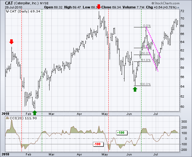
There were four trend signals within a seven-month period. Obviously, a 20-day CCI is not suited for long-term signals; chartists should use weekly or monthly charts for those. The stock peaked on 11-Jan and turned down. CCI moved below -100 on 22-January (8 days later) to signal the start of an extended move. Similarly, the stock bottomed on 8-February and CCI moved above +100 on 17-February (6 days later) to signal the start of an extended advance. CCI does not catch the exact top or bottom, but it can help filter out insignificant moves and focus on the larger trend.
Overbought/Oversold

Identifying overbought and oversold levels can be tricky with the Commodity Channel Index (CCI), or any other momentum oscillator for that matter. First, CCI is an unbound oscillator. Theoretically, there are no upside or downside limits. This makes an overbought or oversold assessment subjective. Second, securities can continue moving higher after an indicator becomes overbought. Likewise, securities can continue moving lower after an indicator becomes oversold.
The definition of overbought or oversold varies for the Commodity Channel Index (CCI). ±100 may work in a trading range, but more extreme levels are needed for other situations. ±200 is a much harder level to reach and more representative of a true extreme. Selection of overbought/oversold levels also depends on the volatility of the underlying security. The CCI range for an index ETF, such as SPY, will usually be smaller than for most stocks, such as Google.

Bullish/Bearish Divergences

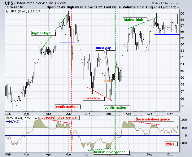
Divergences signal a potential reversal point because directional momentum does not confirm price. A bullish divergence occurs when the underlying security makes a lower low and CCI forms a higher low, which shows less downside momentum. A bearish divergence forms when the security records a higher high and CCI forms a lower high, which shows less upside momentum. Before getting too excited about divergences as great reversal indicators, note that divergences can be misleading in a strong trend. A strong uptrend can show numerous bearish divergences before a top actually materializes. Conversely, bullish divergences often appear in extended downtrends.
Confirmation holds the key to divergences. While divergences reflect a change in momentum that can foreshadow a trend reversal, chartists should set a confirmation point for CCI or the price chart. A bearish divergence can be confirmed with a break below zero in CCI or a support break on the price chart. Conversely, a bullish divergence can be confirmed with a break above zero in CCI or a resistance break on the price chart.
CCI  -  Chart 4

egardless of how CCI is used, chartists should use CCI in conjunction with other indicators or price analysis. Another momentum oscillator would be redundant, but On Balance Volume (OBV) or the Accumulation Distribution Line can add value to CCI signals.
Bollinger Bands

*Bollinger suggests increasing the standard deviation multiplier to 2.1 for a 50-period SMA and decreasing the standard deviation multiplier to 1.9 for a 10-period SMA.

Signal: W-Bottoms


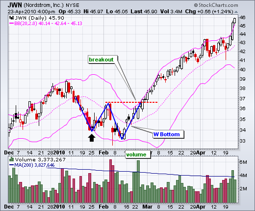
W-Bottoms were part of Arthur Merrill's work that identified 16 patterns with a basic W shape. Bollinger uses these various W patterns with Bollinger Bands to identify W-Bottoms, which form in a downtrends and contain two reaction lows. In particular, Bollinger looks for W-Bottoms where the second low is lower than the first but holds above the lower band. There are four steps to confirm a W-Bottom with Bollinger Bands. First, a reaction low forms. This low is usually, but not always, below the lower band. Second, there is a bounce towards the middle band. Third, there is a new price low in the security. This low holds above the lower band. The ability to hold above the lower band on the test shows less weakness on the last decline. Fourth, the pattern is confirmed with a strong move off the second low and a resistance break.
Bollinger Bands - Chart 2

Signal: M-Tops


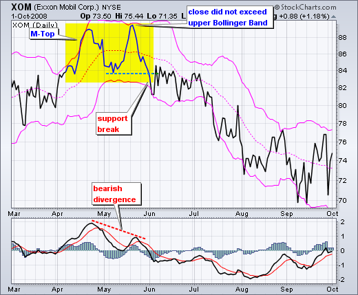
n its most basic form, an M-Top is similar to a double top. However, the reaction highs are not always equal; the first high can be higher or lower than the second high. Bollinger suggests looking for signs of non-confirmation when a security is making new highs. A non-confirmation occurs with three steps. First, a security creates a reaction high above the upper band. Second, there is a pullback towards the middle band. Third, prices move above the prior high but fail to reach the upper band. This is a warning sign. The inability of the second reaction high to reach the upper band shows waning momentum, which can foreshadow a trend reversal. Final confirmation comes with a support break or bearish indicator signal.

Bollinger Bands - Chart 4

Signal: Walking the Bands

Moves above or below the bands are not signals per se. As Bollinger puts it, moves that touch or exceed the bands are not signals, but rather “tags”. prices can “walk the band” with numerous touches during a strong uptrend. Think about it for a moment. The upper band is 2 standard deviations above the 20-period simple moving average. It takes a pretty strong price move to exceed this upper band. An upper band touch that occurs after a Bollinger Band confirmed W-Bottom would signal the start of an uptrend. Just as a strong uptrend produces numerous upper band tags, it is also common for prices to never reach the lower band during an uptrend. The 20-day SMA sometimes acts as support. In fact, dips below the 20-day SMA sometimes provide buying opportunities before the next tag of the upper band.

Bollinger Bands - Chart 6

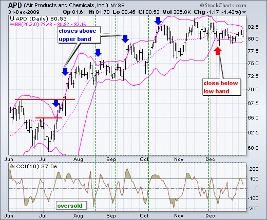
irst, notice that this is a strong surge that broke above two resistance levels. A strong upward thrust is a sign of strength, not weakness. Trading turned flat in August and the 20-day SMA moved sideways. The Bollinger Bands narrowed, but APD did not close below the lower band. Prices and the 20-day SMA turned up in September. Overall, APD closed above the upper band at least five times over a four-month period. The indicator window shows the 10-period Commodity Channel Index (CCI). Dips below -100 are deemed oversold and moves back above -100 signal the start of an oversold bounce (green dotted line). The upper band tag and breakout started the uptrend. CCI then identified tradable pullbacks with dips below -100. This is an example of combining Bollinger Bands with a momentum oscillator for trading signals.

Conclusion

Bollinger Bands reflect direction with the 20-period SMA and volatility with the upper/lower bands. As such, they can be used to determine if prices are relatively high or low. According to Bollinger, the bands should contain 88-89% of price action, which makes a move outside the bands significant. Technically, prices are relatively high when above the upper band and relatively low when below the lower band. However, “relatively high” should not be regarded as bearish or as a sell signal. Likewise, “relatively low” should not be considered bullish or as a buy signal. Prices are high or low for a reason. As with other indicators, Bollinger Bands are not meant to be used as a stand-alone tool. Chartists should combine Bollinger Bands with basic trend analysis and other indicators for confirmation.


Accumulation Distribution Indicator

* The Accumulation Distribution Line is a cumulative measure of each period's volume flow, or money flow.

* Money Flow Volume accumulates to form a line that either confirms or contradicts the underlying price trend. In this regard, the indicator is used to either reinforce the underlying trend or cast doubts on its sustainability.

*An uptrend in prices with a downtrend in the Accumulation Distribution Line suggests underlying selling pressure (distribution) that could foreshadow a bearish reversal on the price chart. 

* A downtrend in prices with an uptrend in the Accumulation Distribution Line indicate underlying buying pressure (accumulation) that could foreshadow a bullish reversal in prices.

Trend Confirmation

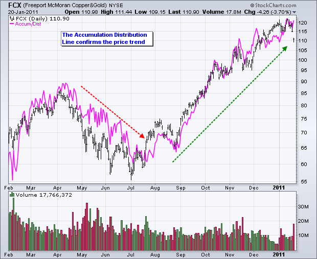
Trend confirmation is a pretty straight-forward concept. An uptrend in the Accumulation Distribution Line reinforces an uptrend on the price chart and vice ver

Chart 3  -  Accumulation Distribution Line

Divergences

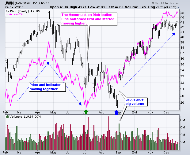
Bullish and bearish divergences are where it starts getting interesting. A bullish divergence forms when price moves to new lows, but the Accumulation Distribution Line does not confirm these lows and moves higher. A rising Accumulation Distribution Line shows, well, accumulation. Think of this as basically stealth buying pressure. Based on the theory that volume precedes price, chartists should be on alert for a bullish reversal on the price chart.

Chart 4  -  Accumulation Distribution Line

A bearish divergence forms when price moves to new highs, but the Accumulation Distribution Line does not confirm and moves lower. This shows distribution or underlying selling pressure that can foreshadow a bearish reversal on the price chart

Chart 5  -  Accumulation Distribution Line

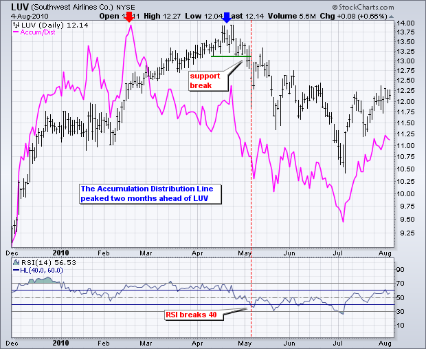
The chart above shows Southwest Airlines (LUV) with the Accumulation Distribution Line peaking two months ahead of prices. The indicator not only peaked, but it also moved lower in March and April, which reflected some selling pressure. LUV confirmed weakness with a support break on the price chart and RSI moved below 40 shortly afterward. RSI often trades in bull zones (40-80) and bear zones (20-60). RSI held in the bull zone until early May and then moved into a bear zone.